A website that gets visits and no calls does not have a design problem. It usually has one of five very ordinary problems.
Every week somebody tells us their site is not working. Before we touch a single colour, we check the same five things, in the same order. Four times out of five the answer is somewhere in that list, and the fix takes a few days rather than a whole rebuild.
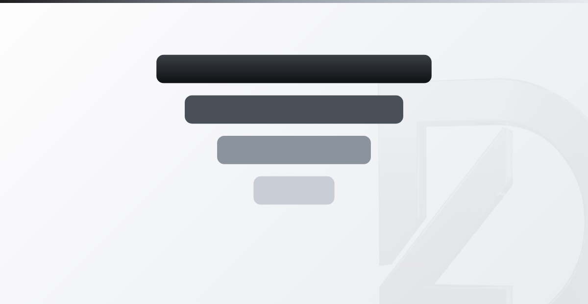
The five reasons, in the order we check them
Open your own site on your phone, on mobile data, and read this list honestly. Most of the sites we are asked to look at fail two or three of the five, not all of them, and that is good news: you have less work than you think.
- It loads slowly. Past three seconds a large share of visitors leave before they have seen anything at all, and you never find out they were there.
- It is not clear in five seconds what you do and who you do it for. The visitor has to read three paragraphs to work it out, and nobody reads three paragraphs.
- It looks broken on a phone: text too small, buttons too close together, a menu that covers the whole screen. That is where most of your visitors are.
- There is nothing that proves you exist for real. No photos of finished work, no reviews, no names of the people or the places you have worked for.
- There is no obvious next step. No phone number in sight, no short form, no WhatsApp button. Interested people leave because leaving is easier than looking.
Which one to fix first
Almost always the second one. Speed and mobile layout are real jobs and they are worth doing, but they only help a visitor who has already understood what you sell. If that person cannot tell in five seconds whether you serve them, a faster site only sends them away faster.
One clear line at the top of the page, written with the words your customers actually use, changes more than a redesign. Not quality and innovation since 1998. Something closer to: we repair wooden windows in northern Italy, usually within two weeks. After that fix the speed, then the phone layout, then the proof, then the next step. The order is deliberate, because each fix makes the following one worth more.

How to check each reason yourself, without paid tools
You do not need a paid audit to find any of this. You need your own phone, a stranger and a notebook. Four checks, about half an hour in total, and you can do them on a Monday morning before you open.
- Speed. Open the site from your phone on mobile data, standing outside the shop, not on the office wifi. Office wifi and a page your browser already remembers hide exactly the problem you are hunting for. Count the seconds out loud until you can read something.
- Clarity. Show the top of your home page to somebody who knows nothing about your business, for five seconds, then take the phone away and ask what you sell and who for. If they hesitate, the line at the top is the problem, not the graphics.
- Mobile and next step. Hold the phone in one hand, the way a customer holds it in the street, and try to call you. If you need the second hand, or more than one tap, or you have to zoom in to read the number, you have found your leak.
- Proof and results. Write down what a stranger can actually verify on your site: photos, reviews, real names. Then count calls, messages and form submissions for the four weeks before your changes and the four weeks after. If the number does not move, the problem is somewhere else and it is worth finding out where instead of adding pages.
What people usually fix, with no effect at all
Most owners who feel their site is failing start with the colours. New palette, new font, a photo with more light in it. It feels like progress because it is visible, and it moves nothing, because the visitor was never confused about your colours. Adding pages has the same problem: a site with four pages nobody reads does not improve by becoming a site with twelve pages nobody reads.
Two other popular repairs actively cost you money. A rotating carousel at the top hides your main message behind slides that most people never wait for, and it slows the page down as well. Animations that fade each section in as you scroll delay the text by a fraction of a second every time, which is precisely what a visitor on a weak connection cannot afford. None of these four things are wrong in themselves. They are simply what you do after the five above, not instead of them.

In short
- Clarity at the top of the page comes before beauty.
- Test on your phone with mobile data, never on office wifi.
- Proof beats adjectives: photos, reviews, real names of clients.
- One obvious next step per page, reachable with one hand.
- Count calls and messages four weeks before and after.
If you would like us to go through these five points on your own site, start here: contact page.